|
In this lesson, I have been asked to create a logo for different individual, product, company, organization, service, club, and activity. To create my logo, I used many tools. Among the many tools that I used, pen tool is the most frequently used. For last assignment, which is about the color, I also used pen tool. This tells me that pen tool is useful tool to be used for later assignments. Throughout the lesson, to show as an example, I have chosen a picture. When the picture is hard, it made me to constantly change the logo or search for examples again. Therefore, I had to spend a lot of time. To solve such problem, I didn't;'t include any examples, rather, I just drew myself as I realized the difficulties behind. 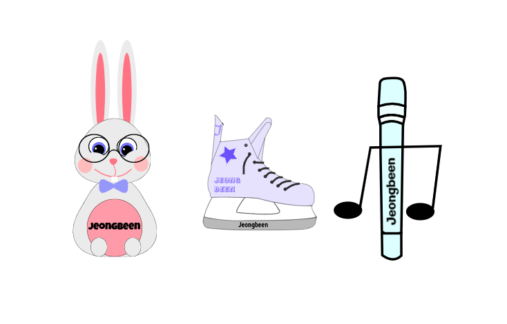 For "mading logo", I wasn't able to think about brand, so I had to use my name.When I was thinking about what makes a good logo for my name, I decided to first create a just normal and simple design. However, I think the logo would have been better if it contained a meaning. The first idea was rabbit. I have a two front teeth like a rabbit, so some people said I look like a rabbit. Second is ice hockey skate. When I was young, I played ice hockey. Third is music and microphone. I enjoy listening music. In final, I chose to create a logo with rabbit. I believe that rabbit represents me the best. If others see this logo, they would easily recognize that it belongs to me. 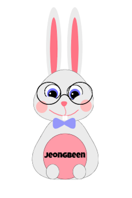
0 Comments
In this lesson, I learned about color. I loved drawing, so I thought it would be easy, but it wasn't. I didn't realize there are these much color in our life, and I think it's so interesting that they all have their own names. While I do my color names summative, I need to choose 15 colors. However, for me I draw the lp, so I need to choose more than 15 colors, also that they can matching well. Until choose 12th colors, I don't really had a problem, but for start choosing 13th colors, I didn't know which color to choose. For this problem, first I choose any color. However, it looks similar to other color that I already chosen, so I thought I need to choose again, but I don't have to. When I check the RGB values and HEX code, I realized they are different color. Also, I learned even the colors that look the same, there are very subtle differences. For the color schemes summative, I learned many names and different types of colors. I learn monochromatic, analogous, complementary, triadic. I used Adobe Color website to find out name of each color. Colors have own names like us. I use gravit pen tool in each summative. I think pen tool is so useful. I can draw the thing easy and convenient. Color Names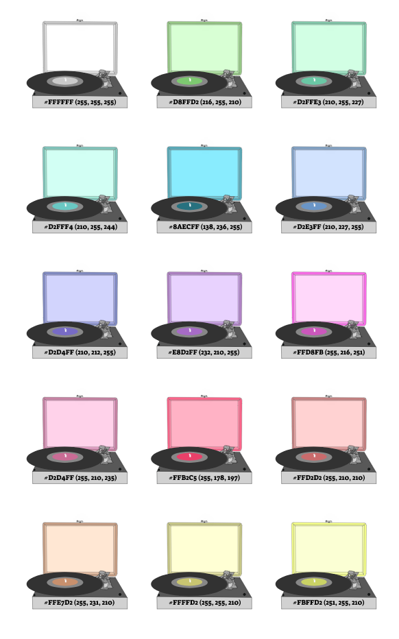 Color Schemes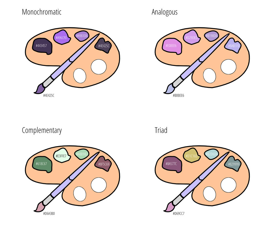 In this lesson I learned about typography and it helped me to realize there are a lot of fonts in our life. I was interested in typography before learning this unit, but I didn't have the opportunity to learn it, so I think I've focused more on learning than any other unit. I think I can explain typography with lego. When I make legos they have a place where they fit. It also looks bad after it's finished. Also, the finished one doesn't look good. Lego looks very easy and simple, but it takes a lot of time to think what is more fit in this place and is this fit in here. If one thing is in the wrong place, everything looks in the wrong place. Like this typography needs to spend a lot of time to think whether this font fits in this word or not, and also the size and place is in the right place or not. Typeface Comparison In this assessment I used five different font that I learned at class, write down five same words. Five same words but different font look they have different meaning. For example, if word "My teddy bear" with sans serif font seems like children said to their favorite teddy bear, on the other hand script font look like one women or men is say to her or his wife, husband or their favorite things. Serif The font that has feet in the bottom. Sans Serif The font that has no feet on in the bottom. Monospaced The font that has same amount of space. Script The font that cursive. Display The font that good attention getters. 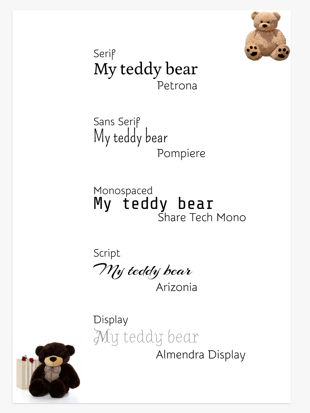 Word PortraitsIn this assessment, I learned about different fonts and how each font has a specific style. For example, there is a font call "Trade Winds," it fits to the word "snowflake," but it doesn't really fit to the phrase "sunny day." Like this, the font has the place, color, and size they fit in. If they aren't in that place, color or size, it looks very bad and doesn't make sense. It can even look boring and very plain. So, we should put a pretty font in your poster or cover when you sell something. I should use two same font and two different word that one is matches the font well, and the other is not match with the font. Also, you have to write a total of 10 fonts and 20 words. 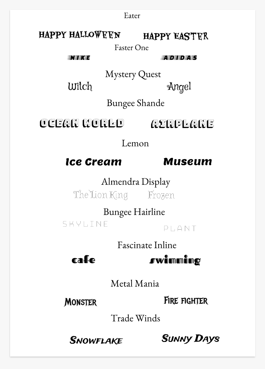 In pen tool summative, I learn how to cut the image and how to use the pen. When use the pen tool, sometimes it doesn't save well or it takes a lot of lag. Then, I will ask teacher for help, or I will rest few minute and try again. After solving the problem, the problem is that I always have not much patience. So I finished this pen tool activity and develop my patience. Except drawing, pen tool help us to do a lot of things. It help us to cut the image, make a shape, and fill color. If someone ask me I will use pen tool on gravit after this summative, to be honest I think I will use this often. My final illustration is about "Warning", the title song of my favorite singer Kim Sejeong recent mini album "I'm". First, mini album "I'm" is about Sejeong Kim, herself. The main color of album is purple, so I put the photo that she dressed in purple. It is also the first all songs written and composed herself. I recommend you to listen to the all the songs in this album at least once. Back to the main point, in the mini album, my most is "Warning" because Because it’s comforting. The lyrics most gave me comfort were "let's do it. If it doesn’t work out, we can just come back." The song "Warning" is about "Let's walk slowly, long, long", "It's okay to take a break". When I rest, what comes to mind is travel, and when I travel, what comes to mind is the sea, so I put a sea on my background and put two warning mark on the sky. Sejeong has turtle tattoo on her foot. Sejeong has turtle tattoo on her foot, it means "Let's walk slowly, long, long." so, I put the big turtle under her. Here is the image source: Background (Beach) Warning mark (Sign) Warning mark (Siren) Sejeong Kim (Insta) Turtle (Twitter) 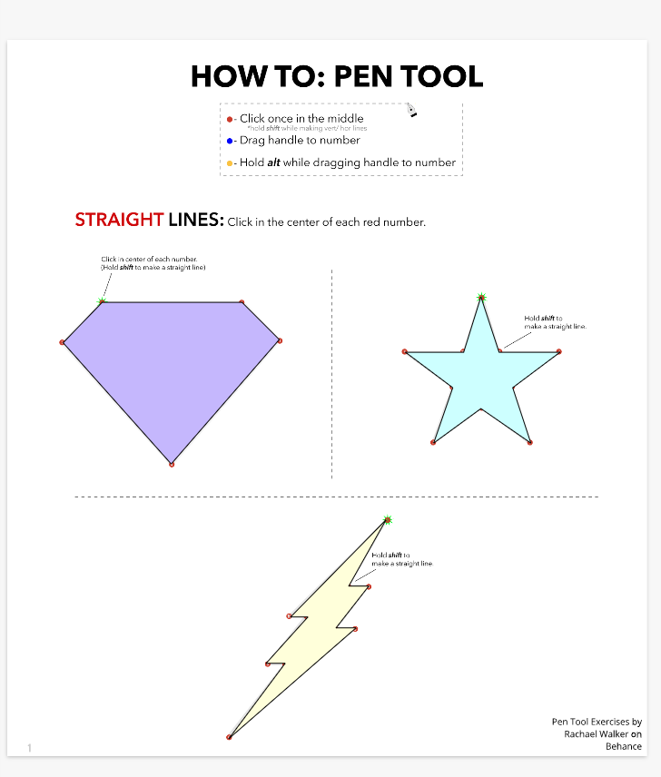 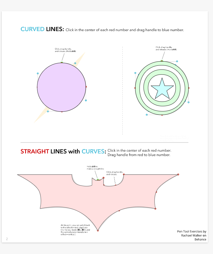    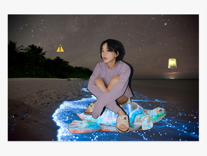 In Korea new year, many people go to mountain to see the sunrise because sunrise at new year means "Good New Start." Covid-19 start at 2019 and is still present now. A lots of people including myself, hope Covid-19 quickly goes away. Also vaccines are came out in many country. When Covid-19 finish, I will first go to watch sunrise for "Good New Start." 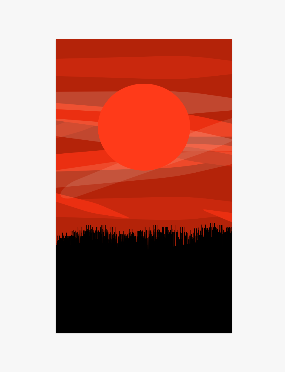 I learn how to make one shape use a lots of shapes. Also I learn how to make square, circle, star, and triangle to different shapes. 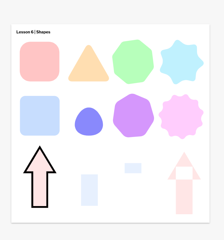 I learn how to made a lot of shapes in one group. Also I learn keyboard shortcuts. 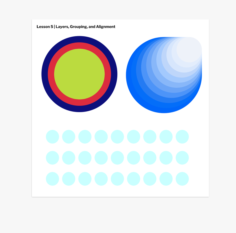 I learn how to put the path which is blue line in different ways. For example, I learn how to put that blue line in the center, inside, and outside. 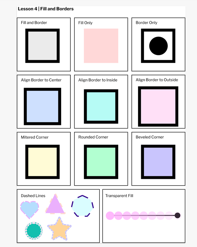 I learned how to make a lot of kind of shape in gravit. And I also learned different off subselect tool and pointer tool. 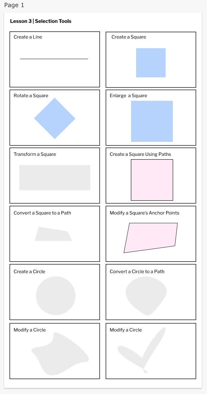 I learn how to made many kind of design and write a text on gravit.  |
Categories |
 RSS Feed
